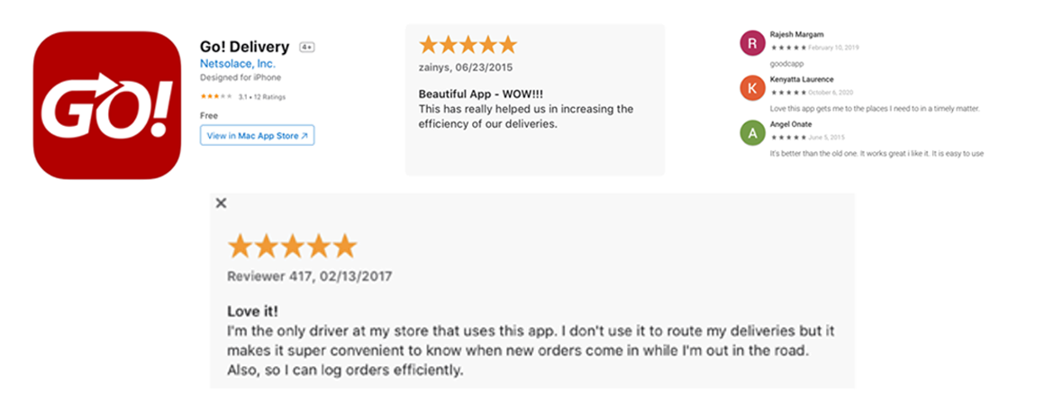
GO! Mobile Delivery App
Edible Arrangements
Led end-to-end redesign of Edible Arrangements' internal delivery driver app — adding new capabilities, refreshing the brand, and positioning the product as a sellable SaaS platform for any delivery-based business.
More Than a Facelift
The Problem
The Goal
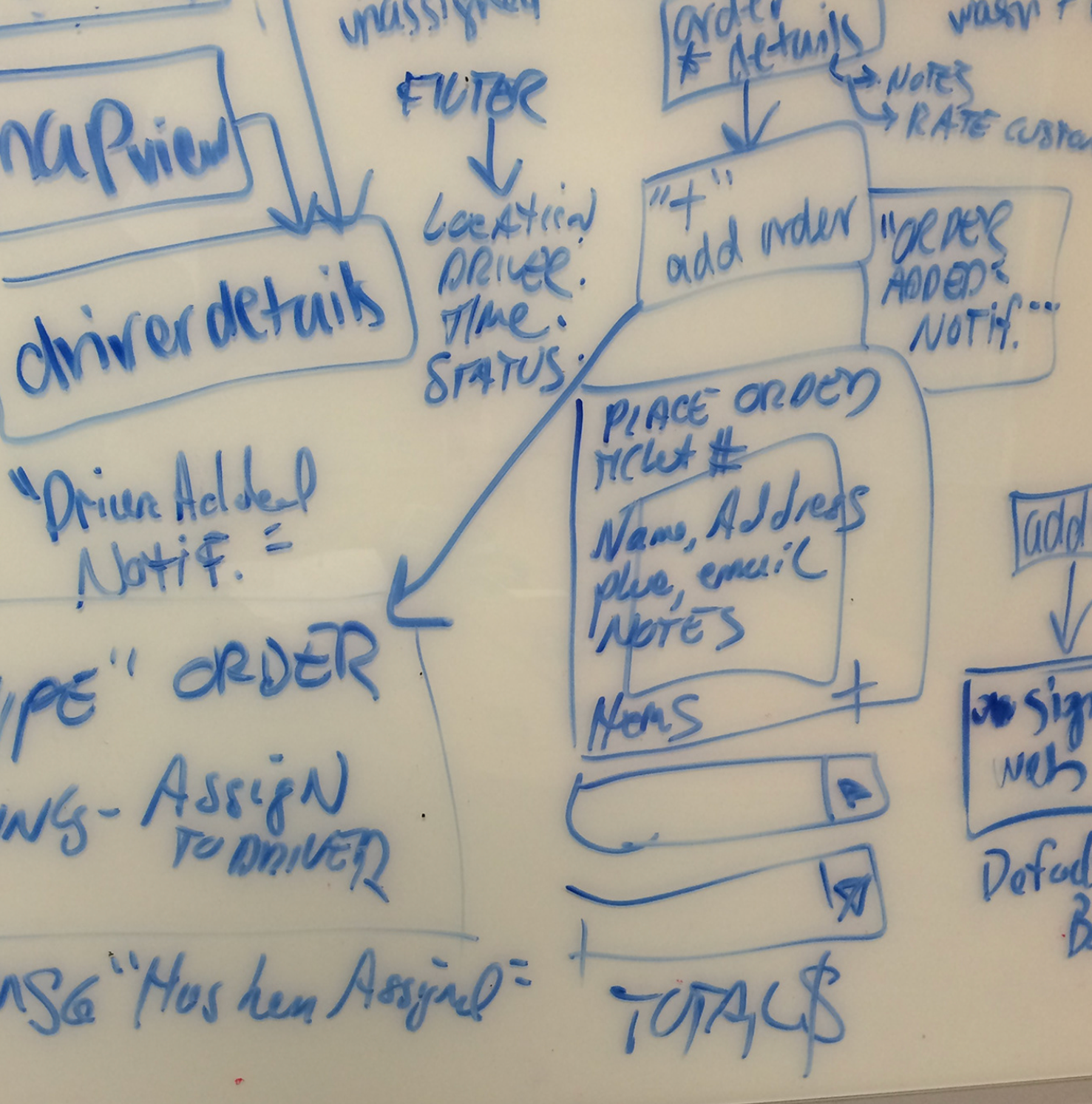
Requirements by User Type
Drivers
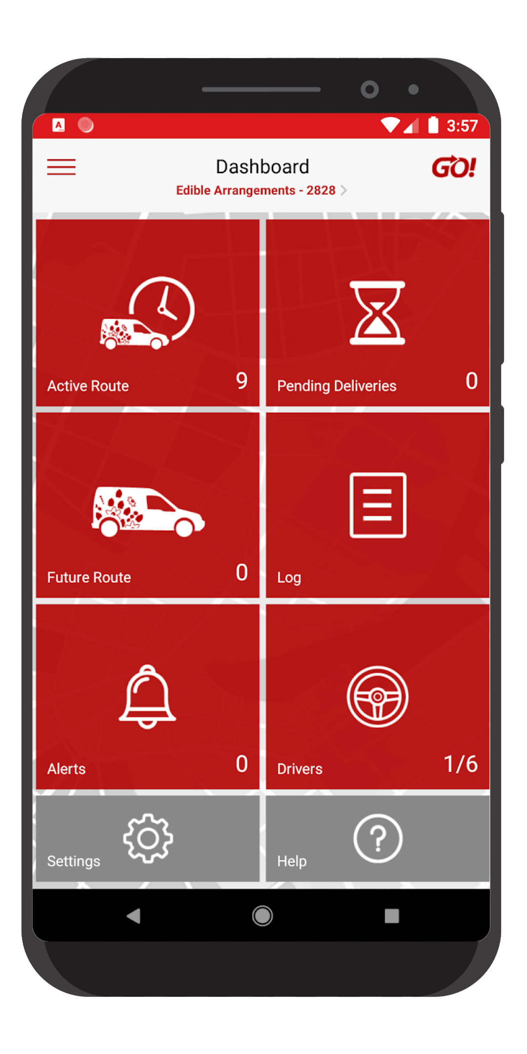
Map view with multiple delivery routes, ability to sort stops by closest proximity, and photo upload and sharing for proof of delivery.
Customers
Digital signature capture upon delivery receipt — eliminating paper and creating a clear record for both customer and driver.
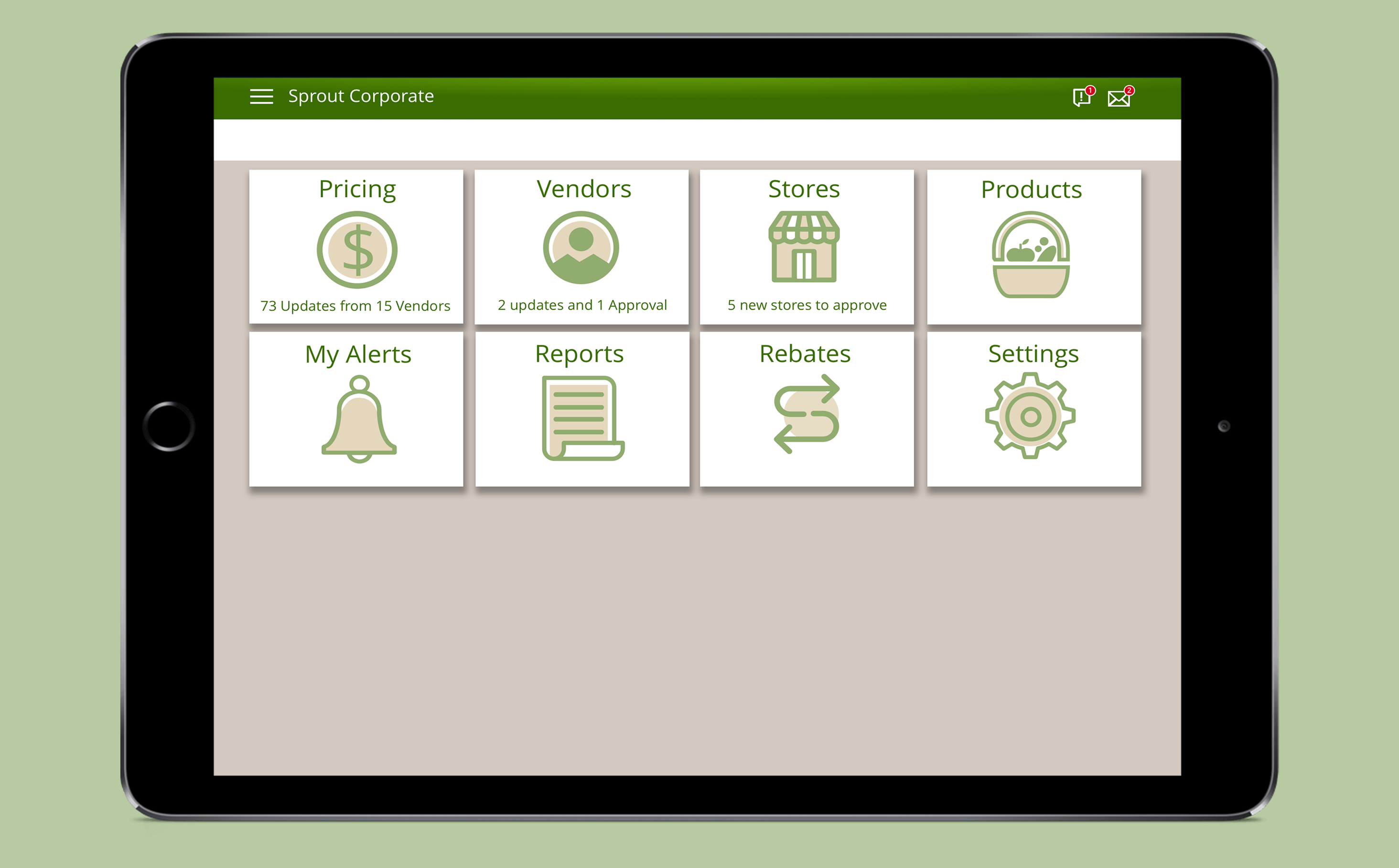
Managers
Visibility into driver routes both individually and as groups — plus the ability to assign a specific delivery to a specific driver.
Corporate
Updated UI and branding, improved look and feel, and better usability across all existing features.
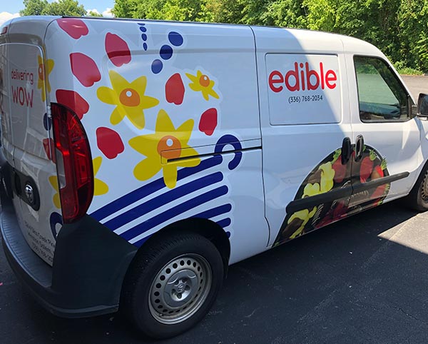
Driver Ride-Along
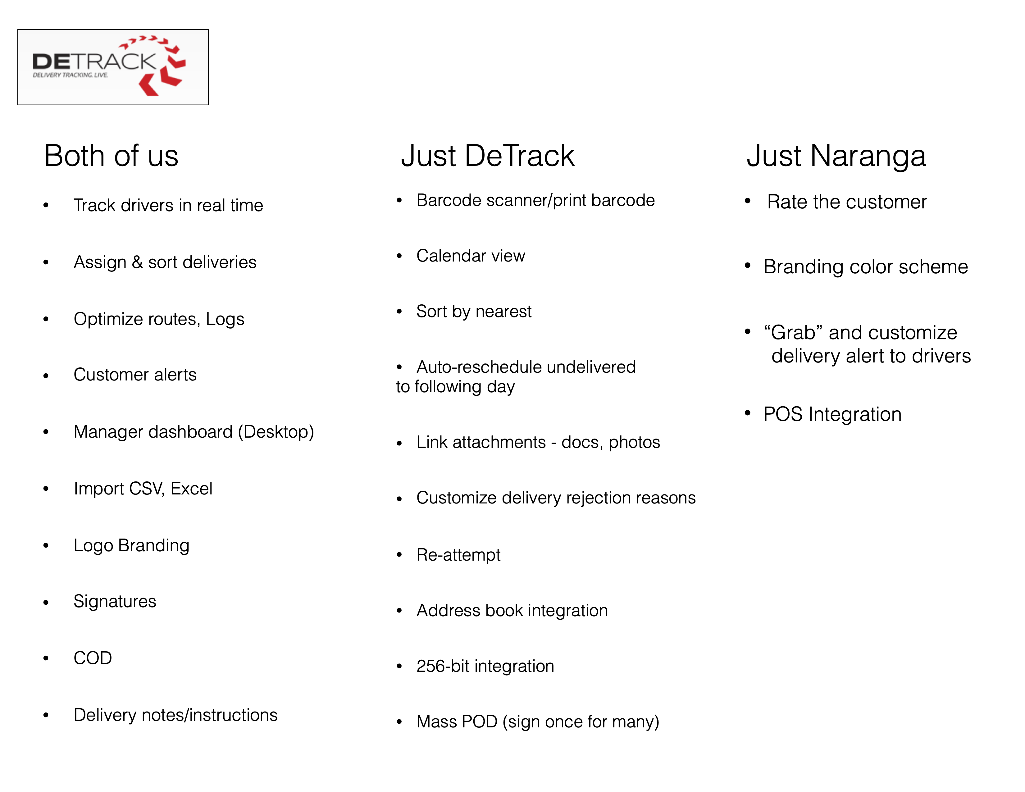
Competitive Analysis
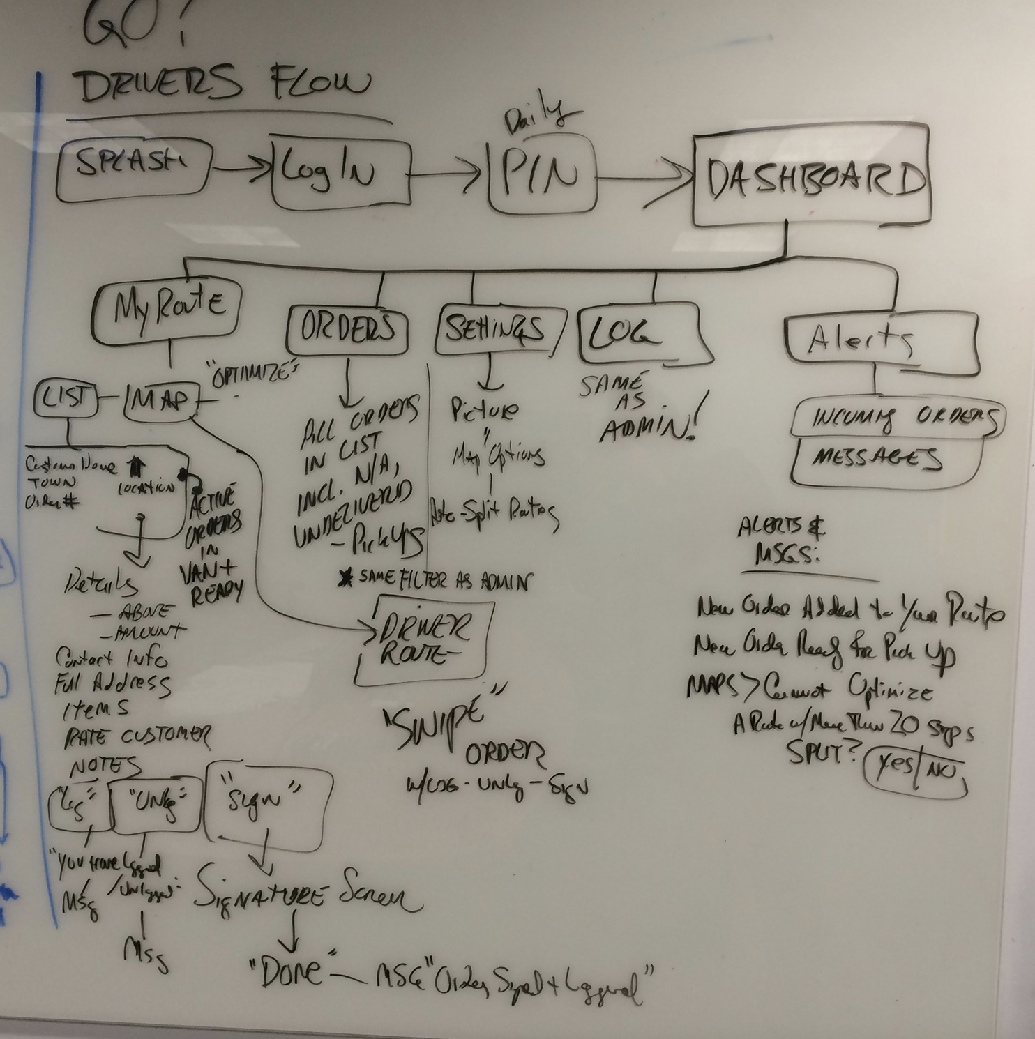
How We Solved It
- 01
Human-Centered Visual Direction
Early branding concepts leaned into large, beautiful photography with minimal clutter — conveying the human side of delivery work on the splash screen while establishing a modern visual identity that differentiated GO! from purely utilitarian competitors.
- 02
Color-Coded Interface System
The final UI used color-coded designations for alerts and delivery types — giving drivers an at-a-glance system for understanding priority and status without reading dense text while on the road.
- 03
Manager Flow Redesign
Added the ability for managers to assign specific deliveries to specific drivers — a gap in the original app that required re-mapping the manager flow entirely to support both individual and group route visibility.
- 04
Driver Flow Enhancement
Updated the driver flow to support route splitting, proximity-sorted stops, customer notes, and photo capture — addressing the core usability gaps surfaced during the ride-along and competitive analysis.
Mapping Flows
Early Concepts
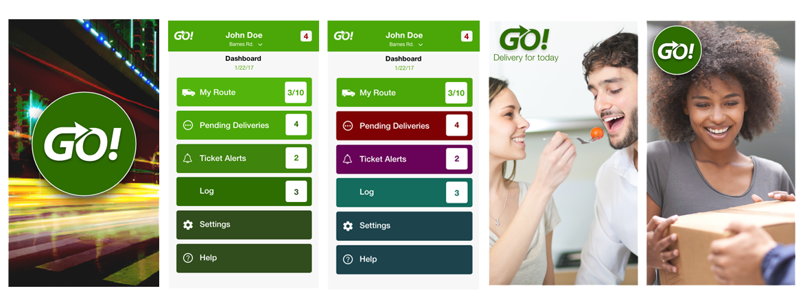
Human-centered Visuals
I wanted to convey a human aspect to the delivery app, and also follow some current trends of large beautiful photos with little clutter for a splash screen. In addition, the interface with color-coded designations for alerts, certain delivery types.
Final Design
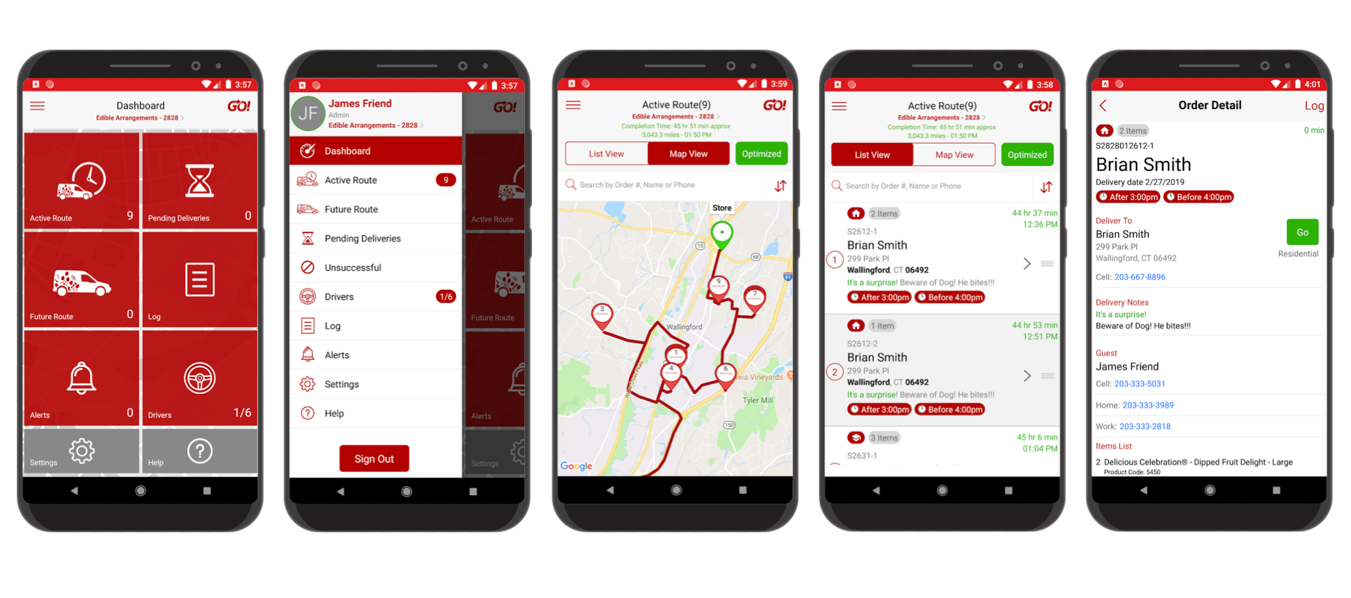
All Business Approach
Stakeholders wished for a more uniform look with branded edible arrangements colors. We pivoted to a delivery business-first approach, so human-centered photos were dropped.
Improved Ratings, SaaS-Ready Product