Marketplace Mobile App
Edible Arrangements
Sole designer on a B2B mobile app that empowered Edible Arrangements franchise store owners to order supplies, manage inventory, and communicate with vendors — from anywhere. The project addressed deep structural problems with the existing web platform while adding entirely new mobile-first capabilities.

A Website That Was Getting in the Way
The Problem
The Assignment
Stakeholder Requirements
Fewer Clicks
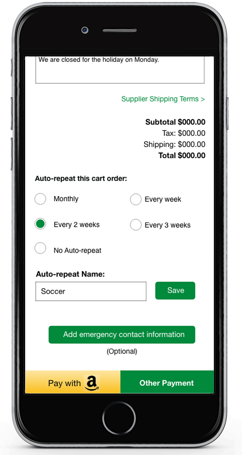
Re-envision all purchasing flows to streamline the process — including adding new payment options: credit card, check, Amazon Pay, and deferred payments.
Mobile-First
Empower store owners to order goods for their stores while traveling or away from the office — a capability the existing website simply could not offer.
Suggestive Selling
The app should recommend complementary products at key moments in the purchase flow — surfacing cross-sell opportunities that the flat website missed.
Supplier Controls
Suppliers needed a login where they could update stock levels without the ability to permanently delete products — a critical data integrity requirement.
What Store Owners Said
- Search results returned items in wrong categories; there was no mobile version for managing orders on the go
- Multi-store owners had no way to switch between their locations
- The communications area was hard to find
- There was no Auto-Ship option for regularly ordered items
- No mobile version
The single comment that every person interviewed made, without exception: "Make it like Amazon."

The Search Problem Had No Easy Fix
How We Solved the Experience
- 01
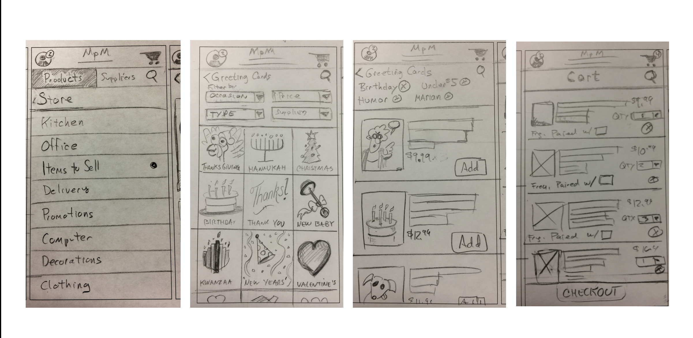
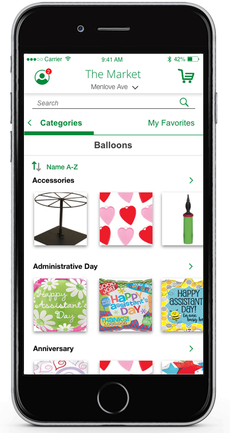
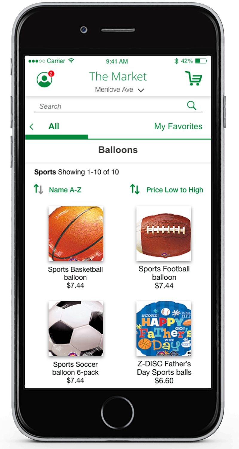
Filtering by Category, Supplier, and Occasion
Rather than relying solely on text search — which produced poor results due to tagging issues — we added robust filtering as a primary navigation mode. Users could browse by category, supplier, or occasion and find what they needed without typing a single word.
- 02
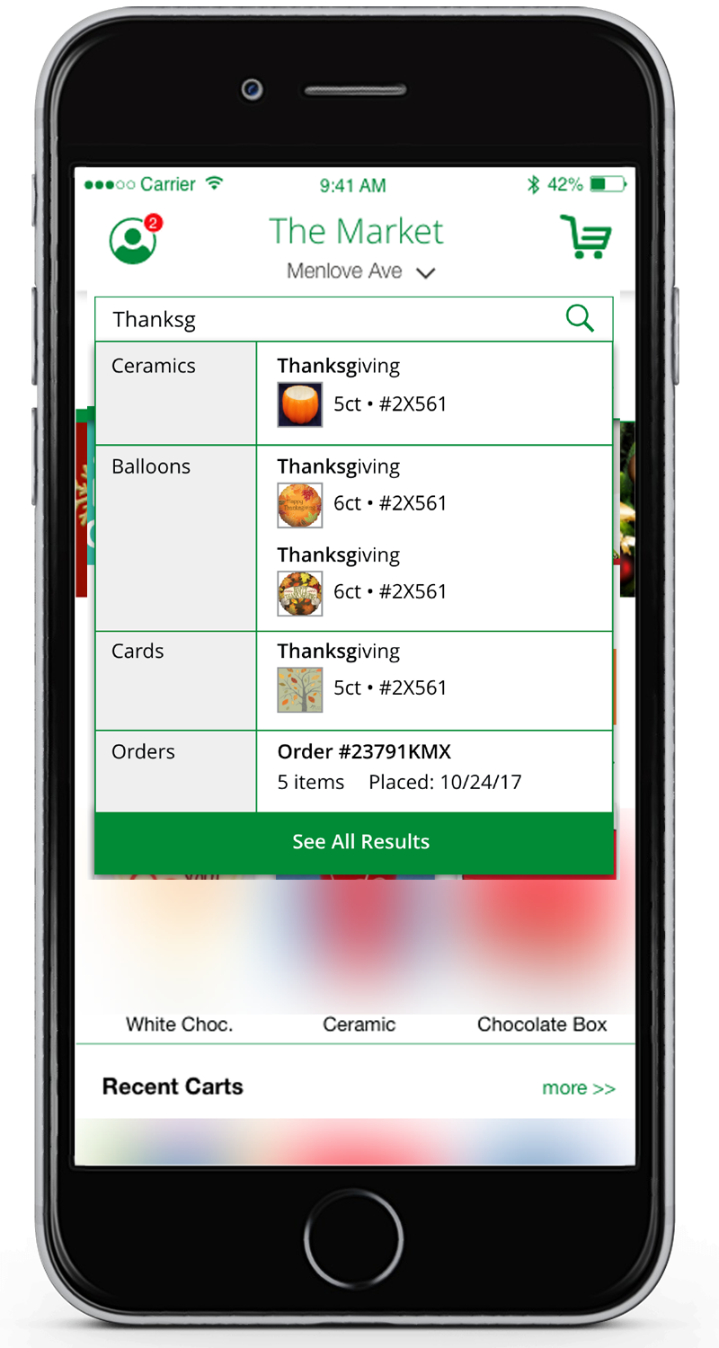
Predictive Text Search
For users who did want to search, predictive text provided easy access to product pages — filling the gap while the underlying tag quality remained inconsistent.
- 03
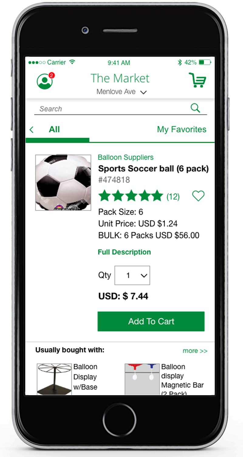
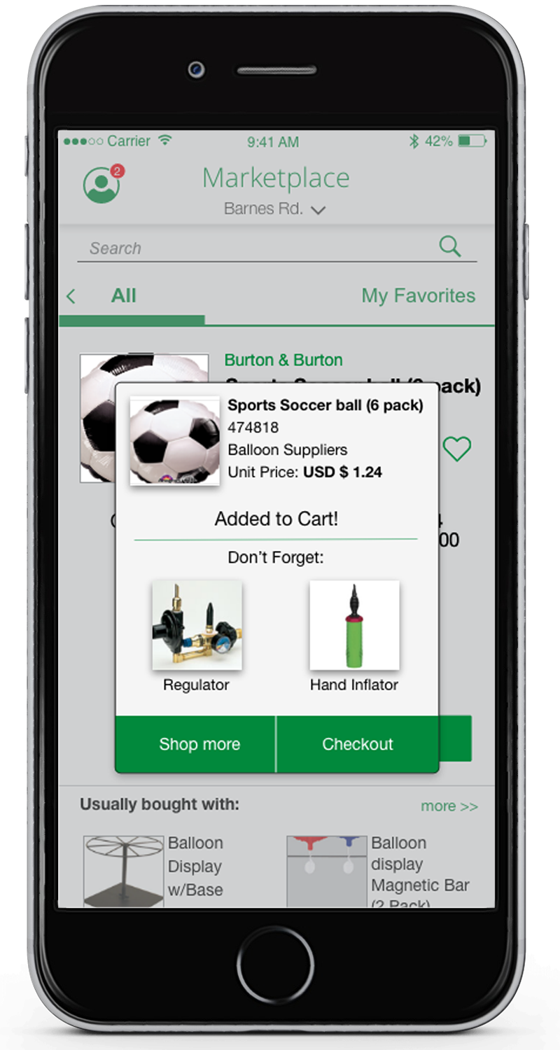
Suggestive Selling Throughout the Flow
Cross-sell banners appeared in search results and on the home screen. Product pages featured a 'Usually Bought With' section. The cart included a 'Don't Forget' module. Every handoff moment in the purchase flow became an opportunity for discovery.
- 04
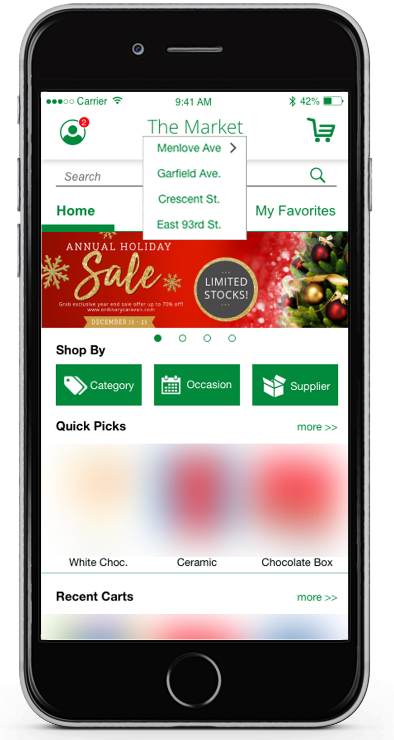
Multi-Store Owner Support
A top-level store selector let multi-location owners choose which store they were shopping for. All pricing, payment options, and delivery details adjusted automatically to the selected location.
- 05
Auto-Ship
In the cart, users could flag items for Auto-Ship and set the frequency — directly addressing one of the most consistent requests from the interview phase.
- 06
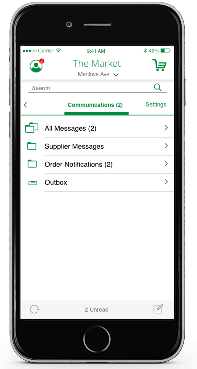
Mailbox-Style Communications
The previously buried communications area was redesigned as a mailbox-style inbox accessible directly from the profile icon — making it easy to find and use without hunting through menus.
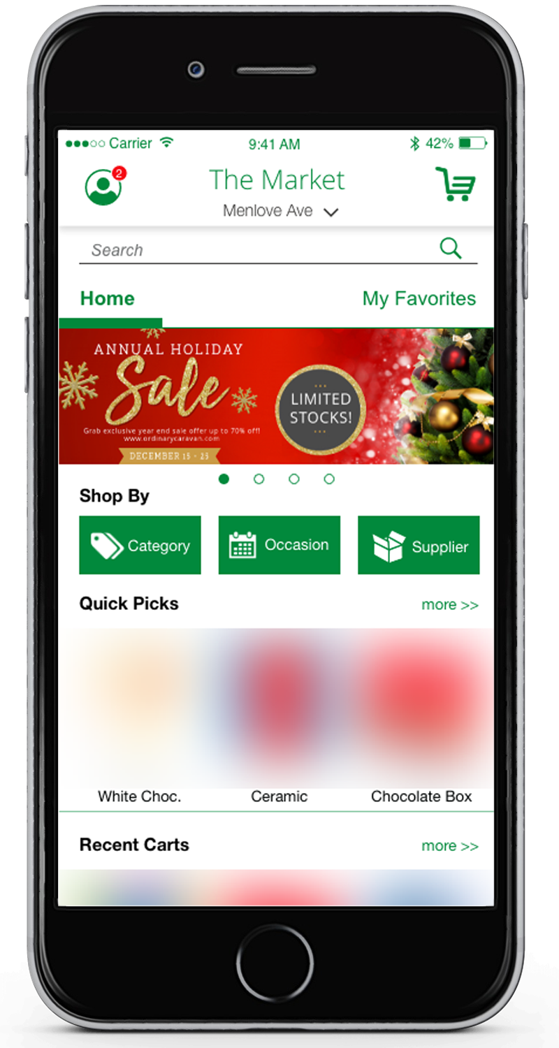
Store Owner Screens
This included banners, recent carts and as a user scrolls down they see featured items, and current deals upfront.
Added Filtering by Category, Supplier, or Occasion.
Subcategories, Product Detail & Autoship
New Capabilities for Suppliers
- 01
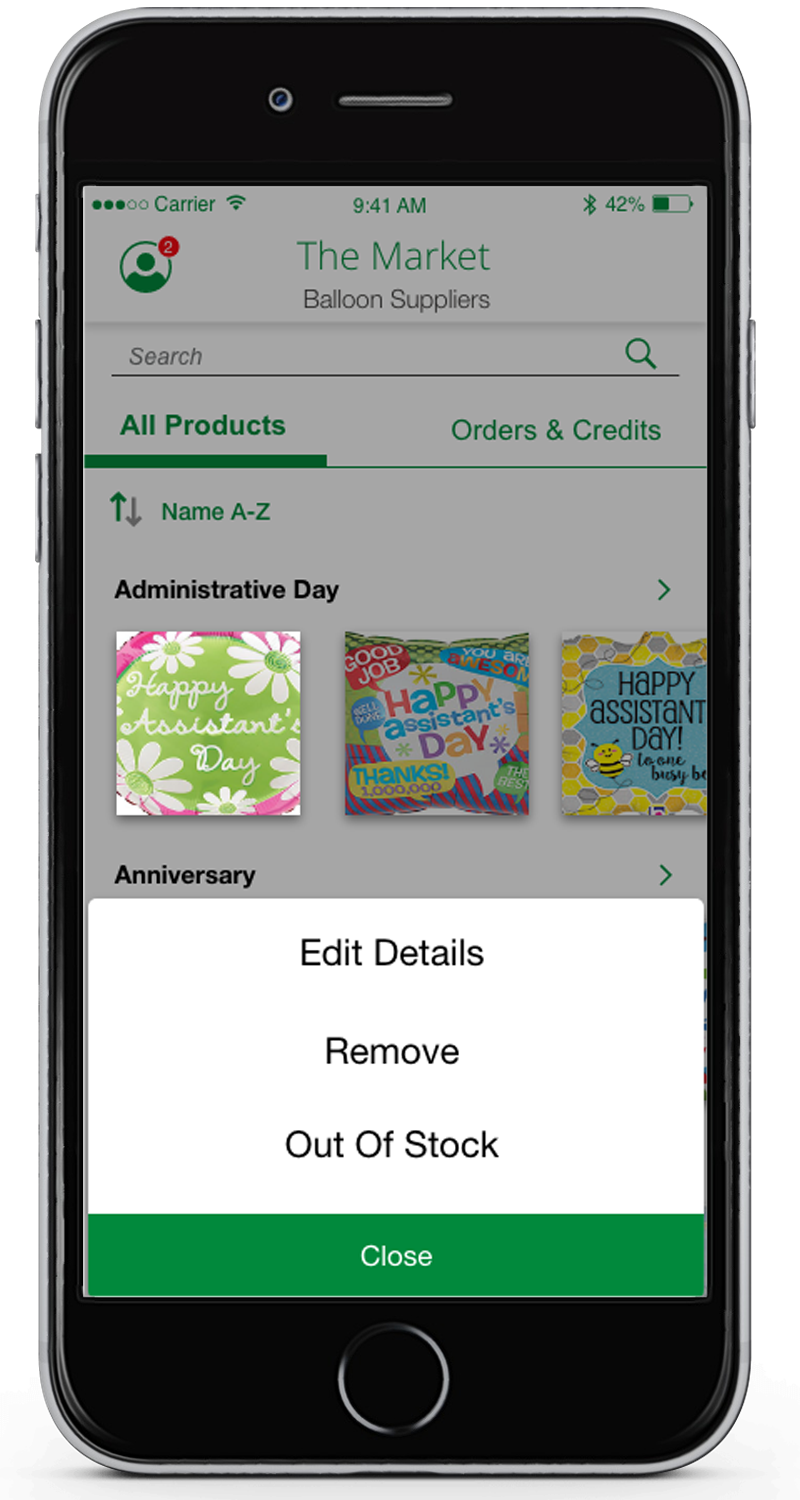
Product Management
Vetted and approved vendor accounts could quickly update product listings — marking items as Out of Stock, adjusting availability, or choosing to edit details — without the ability to permanently delete products from the catalog.
- 02
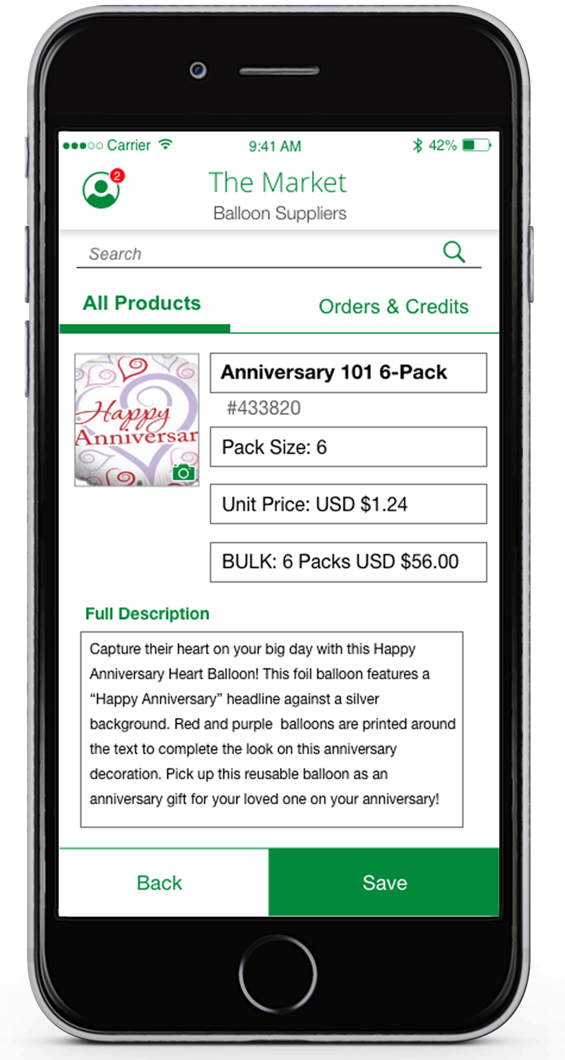
Product Detail Editing
Vendors could edit the product type, name, pricing, and description directly from their mobile account — removing the dependency on central admin for routine catalog maintenance.
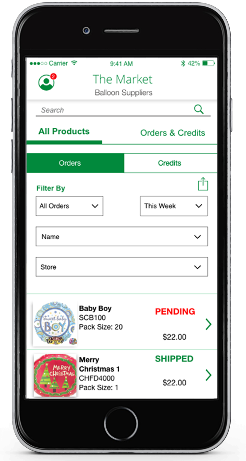
- 03
Shipment Tracking
Vendors gained visibility into their shipments across all stores — a new capability that reduced inbound support requests and gave suppliers a clearer picture of their distribution.
Editing Product Details
Store Owners and Vendors Put It Through Its Paces
What They Said
The Dev Challenge
What Comes After Launch